Saturday, March 13, 2010

Eyebrow Series

For the last several years I have looked at works by Takashi Murakami and wondered what I might do in that spirit. I was trying to think of image. Well, I decided to work with an eyebrow motif in symbolic form. Some years ago I was at a Supercuts and the hair stylist was all set to do trim my eyebrows. I got a little ticked that he was just about to cut them.

I’m not sure what I’ll do to finish them. Maybe they are finished. Anyway, I’ve been on the fence with these for five years now. Hopefully something will move me. They are now in a place where I am forced to see them.


acrylic on canvas, 4 canvses, 8" x 8"

Friday, February 19, 2010

Sketchbook Cover

Since I had given my students sketchbooks, I wanted to encourage them to decorate their sketchbook covers. I got the idea from an art professor I met at SUNO. At the beginning of one class, he held up his gradebook and said, “this is not finished.” The next time the class met, he showed us the outside cover on which he had drawn with different colored markers.

For this drawing, I used a white enamel paint pen. I began with simple shapes in a patterned along the other edges of the sketchbook. Gradually I worked my way to the center of the cover. This is just one side of the sketchbook.


enamel paint on sketchbook cover, 8.5" x 11"

Saturday, January 23, 2010

Super Flat Stool

Some years ago while browsing the Art section of Barnes and Nobles, I happened upon a book called The Japanese Experience: Inevitable. The book featured the work of a group of artists that call their art “Super Flat.” It is a Japanese Pop Art movement. I bought the book, which traces the art movement’s history to earlier Japanese art – sometimes described as a “floating world.”

The students, I was teaching at the time, were very excited about Japanese Animé. So the content of the book fit the kids’ interests. I had the idea to take an unfinished stool and add a Super Flat-like painting to it. Although I wasn’t successful in getting the students to paint their own stools, they liked seeing me paint my design.


Friday, December 11, 2009

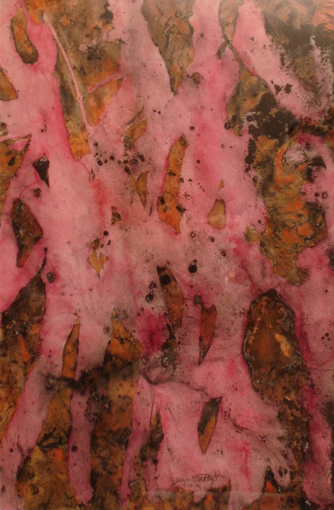
Premonition Pink

When I attended an art educator convention in Boston during the spring of 2005, an ad using pink with orange flames got may attention. So, I used the color combination in this final mixed media piece.


mixed media on paper, 17.5" x 24"

Saturday, November 07, 2009

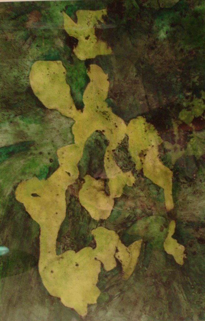
Premonition Green

In this charcoal dust and watercolor mixed media piece, I repeated the process. This time my colors were inspired by the film "House of Flying Daggers."


mixed media on paper, 17.5" x 24"

Wednesday, October 21, 2009

Premonition Orange

Some years back I'd seen a technique demonstrated involving charcoal dust. Water is applied with a brush to areas that are to remain whitest. Charcoal dust is then sprinkled across the page. Then a bucket of water is splashed across the page. The dust sticks to the areas that were dry. This process is best done outside because of the mess involved.

Afterwards I used spray fixative to keep the dust on the paper. On top of the dust I painted watercolors. I was pleased with the result.

This is the first one I did for my students to show them what was possible. Folks have told me it looks like a map. I simply painted complementary colors.


mixed media on paper, 17.5" x 24"

Monday, September 14, 2009

120 Colors

During the spring testing of 2005 I drew this piece beginning with a grid. Using Prismacolor Sticks, I drew expressive lines across my grid. Then I added circles inside each box. I proceeded to blindly pick six colors at random as I filled in each box and the circles within. Filling out testing forms had inspired this part of my piece.


colored pencil on paper, 21" x 26.5"

After I rendering with the six colors, I again chose six random colors. When I reached the last of the 120 colors, I put the rest back in the box and picked at random again. This went on until I completed the piece.

From the outset I was determined to use all 120 colors that came in the Prismacolor box. So often artists are advised to only use a limited palette. Anyway it took a while to finish this drawing.

Sunday, August 02, 2009

Sea Floor Rock

This piece was inspired by sites in Denver, Colorado.


acylic and molding paste on canvas, 20" x 20"

Tuesday, July 28, 2009

Petrified Rock

This piece was inspired by sites in Denver, Colorado.


acylic and molding paste on canvas, 20" x 20"

Sunday, June 14, 2009

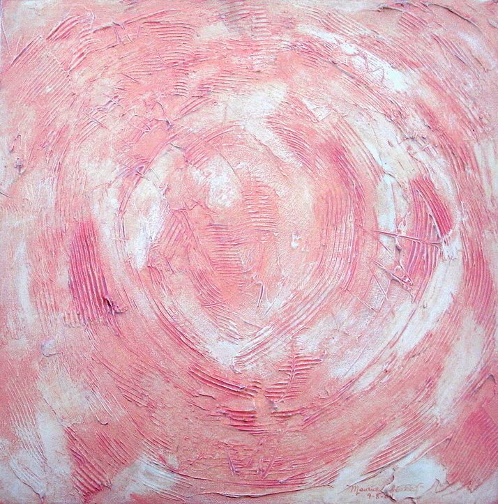
Red Rock

At a workshop I played around with molding paste on canvas. This is one of three pieces that I painted following the workshop. It was inspired by sites in Denver, Colorado. I wanted my students to see an example of using molding paste on canvas.


acylic and molding paste on canvas, 20" x 20"

Monday, May 11, 2009

Artroom

In college when I took the course Freehand II, there was a project we did that involved charcoal rubbings on tracing paper collaged with colored inks. Later on when I was teaching, I thought I’d experiment with the same method. I already had those supplies and I wanted to convince my students to work with mixed media. So I created this piece as a sample. Usually if the students saw me enjoy making a piece first it was an easier sales job to convince them.


mixed media, 11" x 15"

This time I used rice paper to make charcoal rubbings from objects and surfaces around the artroom. I then painted matte acrylic polymer to adhere the rubbings to watercolor paper. After the rubbings were dry, I spray fixed them. I then painted layers of color inks on top of them.

While digging through some boxes I found this piece. I think I will try to do some more works using these materials. It’s a direction that I really had not pursued.

Tuesday, April 21, 2009

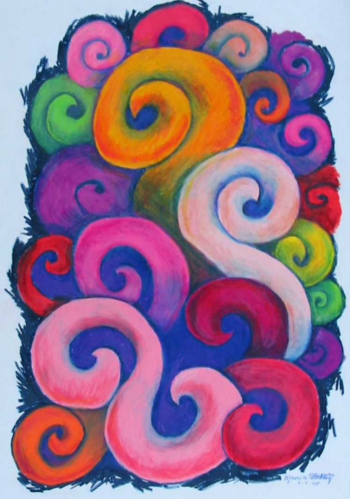
Curls Gone Wild

My reason for creating this drawing was to show my students a finished color pencil piece. I wanted them to see what was possible when layering different colors of color pencil.


colored pencil on paper, 20.5" x 28"